Lesson 2: Rules of Composition
For lesson two, I'll be giving you some simple pointers to keep in mind that will make the quality of your pictures much better - and less boring for others to look at! Believe it or not, there are rules of composition in photography; however, I prefer to call these "suggestions" of composition because there are exceptions to each. Many of these suggestions originated before photography was invented, which was 1827 by the way, and were created by painters.
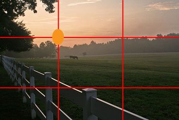
When you look through the viewfinder of your camera to frame the picture you're about to take, there are a few things to keep in mind. Possibly, the most important is "The Rule of Thirds." If you draw three horizontal lines and three intersecting vertical lines across a picture, you would see The Rule of Thirds. By placing the most important elements of a picture at the intersections of these lines, you'll create an image that is more pleasing to look at - really, studies have shown this! This "third" suggestion also is used when taking landscape photos. If the land is the main subject, the sky should only be the top 1/3 of the image and vice versa.
This "suggestion" can also hold true when taking portraits as well. Try off centering the subject of the photograph, you'll probably like it! One of the biggest mistakes people make when taking pictures of people (and most other subjects) is not getting CLOSE enough! You should FILL the frame (viewfinder) with the subject! Anything else that makes its way into the picture is just distracting. If the person is just a speck in the middle of the picture, you're pictures will be boring to look at.
When you're looking through the viewfinder, take some time to soak in what you're looking at. Many people just raise the camera and press the shutter button without putting much thought into it. Take a moment to make sure you aren't cutting off someone's head, or even leaving someone out altogether (I've been the victim of this before and trust me, it's not a fun surprise!) Here are some important things to ask yourself before pressing the button:
1. Is the horizon straight? If not, and this is a common error, it will stick out like a sore thumb. If there is a true horizon, roofline, or waterline, then this will be quick and easy. If not, look for other objects that should be truly vertical - light posts, fence posts, etc - and use these as your guide.
2. The Rule of Thirds! - see above. Of the four intersections, the top left is the strongest point in the image.
3. Perspective - If your subject is movable, would the image benefit from a different background? For example, if you're photographing a person and notice the parking lot behind them, move to their other side and get the tree as the background. Some objects, like flowers, are more interesting from non-traditional directions! Experiment!
4. Diagonal lines create great movement in photos. Instead of taking a picture of a fenced in pasture from straight ahead, move to the side and get the fence line from a diagonal angle disappearing into the horizon.

5. Fill the frame and remove anything that is not a part of your "story!" A picture is worth a thousand words, but a single picture can only tell one story. Anything that is not a part of your story should be removed.
I'll end lesson two here as I feel like this is enough information to digest today. I will begin this posting more than one "lesson" per week to try and pack as much into the 8 weeks as possible. Future topics...
What film speed should you use; will it make a big difference?
How to avoid blurry pictures indoors and in other low-light situations.
Using a flash
Camera settings
When you look through the viewfinder of your camera to frame the picture you're about to take, there are a few things to keep in mind. Possibly, the most important is "The Rule of Thirds." If you draw three horizontal lines and three intersecting vertical lines across a picture, you would see The Rule of Thirds. By placing the most important elements of a picture at the intersections of these lines, you'll create an image that is more pleasing to look at - really, studies have shown this! This "third" suggestion also is used when taking landscape photos. If the land is the main subject, the sky should only be the top 1/3 of the image and vice versa.

This "suggestion" can also hold true when taking portraits as well. Try off centering the subject of the photograph, you'll probably like it! One of the biggest mistakes people make when taking pictures of people (and most other subjects) is not getting CLOSE enough! You should FILL the frame (viewfinder) with the subject! Anything else that makes its way into the picture is just distracting. If the person is just a speck in the middle of the picture, you're pictures will be boring to look at.
When you're looking through the viewfinder, take some time to soak in what you're looking at. Many people just raise the camera and press the shutter button without putting much thought into it. Take a moment to make sure you aren't cutting off someone's head, or even leaving someone out altogether (I've been the victim of this before and trust me, it's not a fun surprise!) Here are some important things to ask yourself before pressing the button:
1. Is the horizon straight? If not, and this is a common error, it will stick out like a sore thumb. If there is a true horizon, roofline, or waterline, then this will be quick and easy. If not, look for other objects that should be truly vertical - light posts, fence posts, etc - and use these as your guide.
2. The Rule of Thirds! - see above. Of the four intersections, the top left is the strongest point in the image.
3. Perspective - If your subject is movable, would the image benefit from a different background? For example, if you're photographing a person and notice the parking lot behind them, move to their other side and get the tree as the background. Some objects, like flowers, are more interesting from non-traditional directions! Experiment!
4. Diagonal lines create great movement in photos. Instead of taking a picture of a fenced in pasture from straight ahead, move to the side and get the fence line from a diagonal angle disappearing into the horizon.

5. Fill the frame and remove anything that is not a part of your "story!" A picture is worth a thousand words, but a single picture can only tell one story. Anything that is not a part of your story should be removed.
I'll end lesson two here as I feel like this is enough information to digest today. I will begin this posting more than one "lesson" per week to try and pack as much into the 8 weeks as possible. Future topics...
What film speed should you use; will it make a big difference?
How to avoid blurry pictures indoors and in other low-light situations.
Using a flash
Camera settings
posted by CThompson at 12:25 AM
![]()


0 Comments:
Post a Comment
<< Home